
Rebranding of IDTA Barbados
Rebranding of IDTA Barbados
2025
Moving IDTA Barbados in a modern direction
Who is the IDTA Barbados?
Who is the IDTA Barbados?
Idta Barbados is the branch office of the International Dance Teachers Association (IDTA) based in the UK, specifically Brighton, England. The IDTA is a dance teaching and examination board that establishes standards across various dance forms. It conducts assessments for both professional and non-professional dancers of all ages and promotes the love of dance through a global community.
Idta Barbados is the branch office of the International Dance Teachers Association (IDTA) based in the UK, specifically Brighton, England. The IDTA is a dance teaching and examination board that establishes standards across various dance forms. It conducts assessments for both professional and non-professional dancers of all ages and promotes the love of dance through a global community.
Why the rebrand?
Why the rebrand?
In late 2024, the newly elected executive committee decided to undergo rebranding to appeal to a broader range of dance styles beyond Ballroom and Latin, in which the IDTA is heavily involved.
In late 2024, the newly elected executive committee decided to undergo rebranding to appeal to a broader range of dance styles beyond Ballroom and Latin, in which the IDTA is heavily involved.
Broader appeal across dance s
In late 2024, the newly elected executive committee decided to undergo rebranding to appeal to a broader range of dance styles beyond Ballroom and Latin, in which the IDTA is heavily involved.

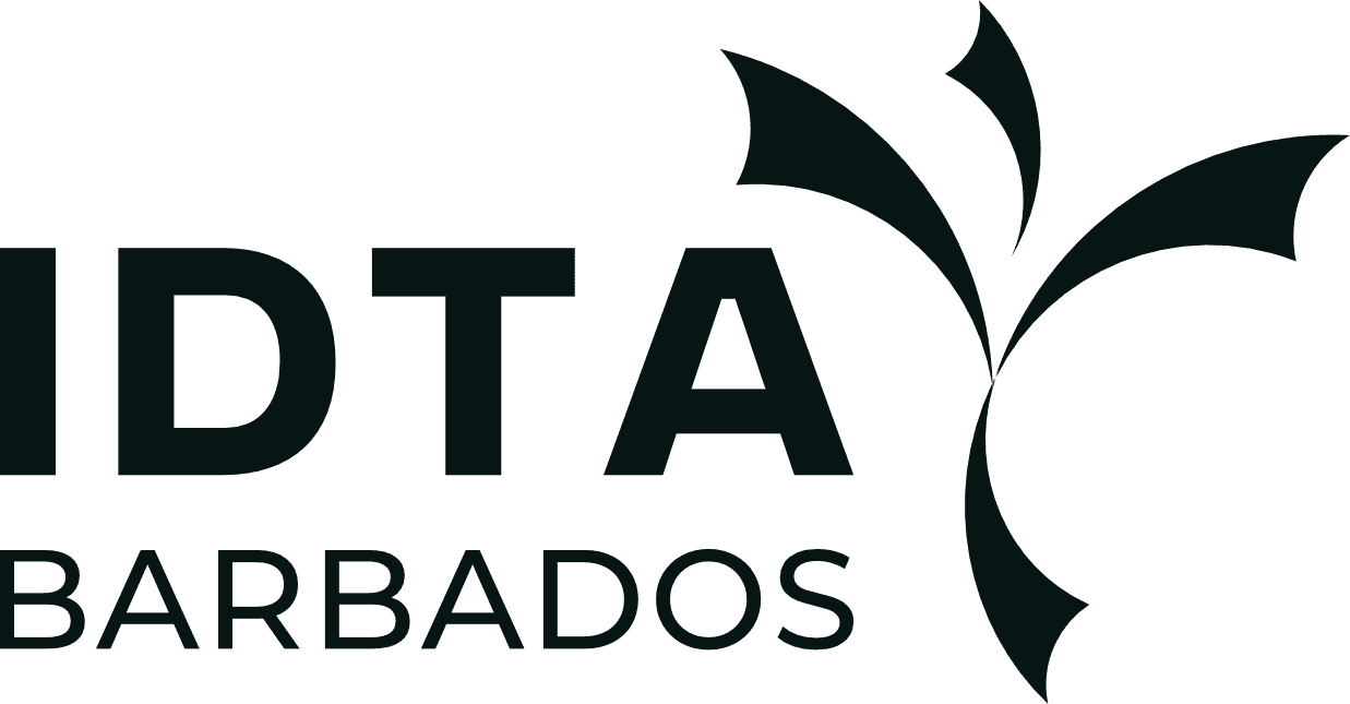
Previous logo

Design objectives
•
Make the brand more appealing to additional dance genres
•
To have a modern visual identity
•
Increased youth engagement
•
Clearer brand recognition
Approach
This project was completed before the SPIRAL framework, but it helped shape its foundations.
This project was completed before the SPIRAL framework, but it helped shape its foundations.
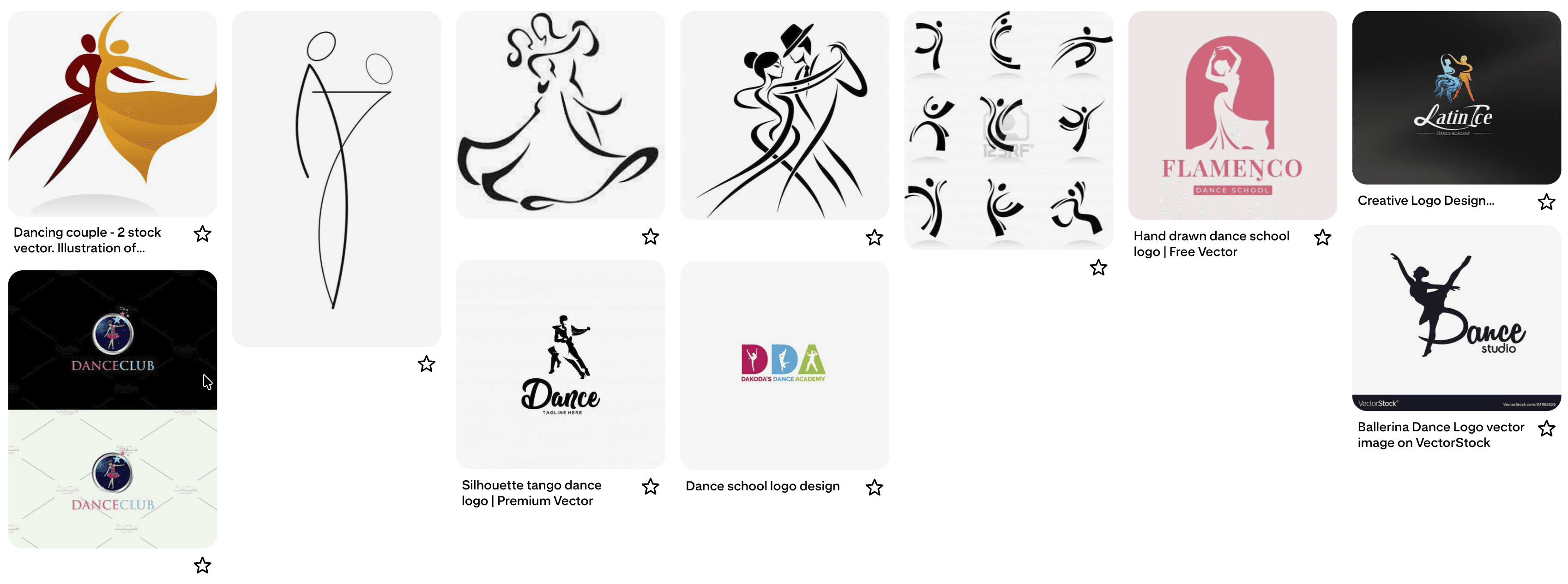
Searches were done for inspiration
Searches were done for inspiration
Pinterest mood-board
Pinterest mood-board
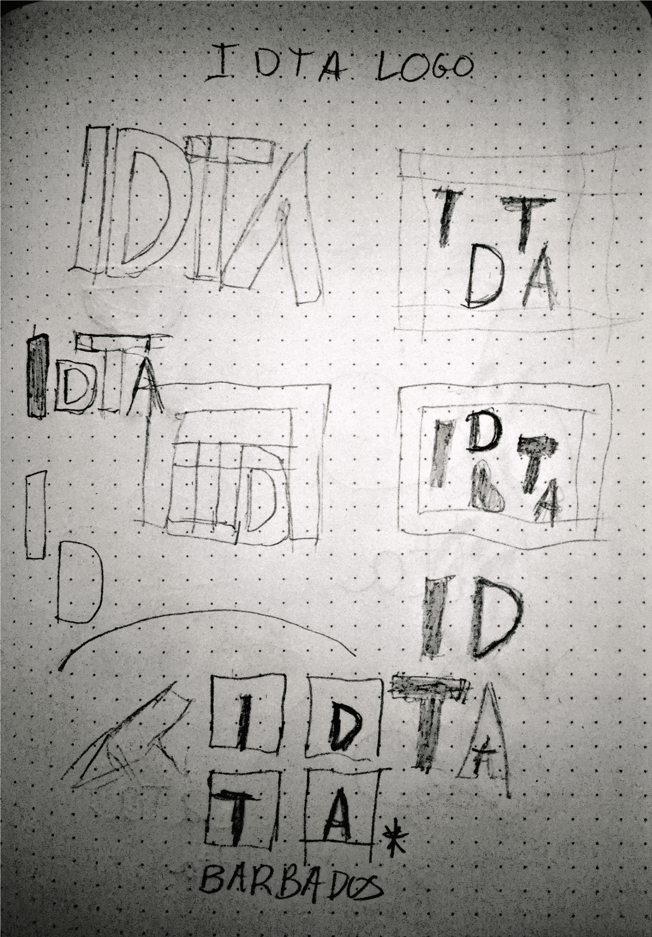
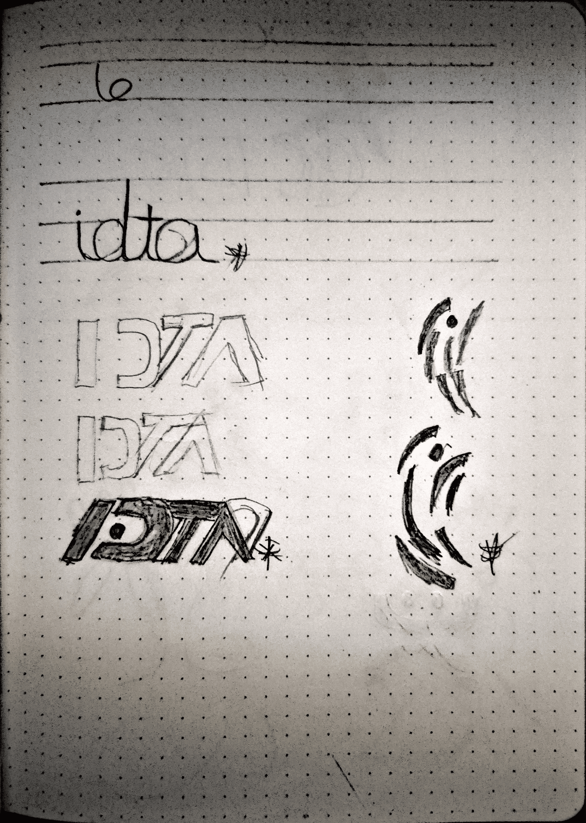
Sketches
Sketches
Sketches are done to get out some different ideas of the symbol that would encapsulate the goals
Sketches are done to get out some different ideas of the symbol that would encapsulate the goals

Idea to life
Three ideas came about from the research
1
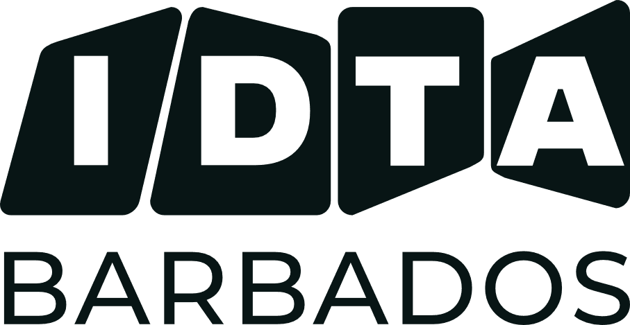
This concept features “IDTA” letters in black geometric shapes, symbolising discipline, structure, and professionalism, which are key in dance education. “BARBADOS” appears below in a sans-serif font, emphasising clarity and national identity.
This concept features “IDTA” letters in black geometric shapes, symbolising discipline, structure, and professionalism, which are key in dance education. “BARBADOS” appears below in a sans-serif font, emphasising clarity and national identity.
2
The 2nd concept features a minimalist “IDTA” wordmark with an abstract petal or leaf motif (pride of Barbados) symbolising movement, creativity, and inclusivity, aligning with the Council’s goal to attract diverse dance styles. Its clean, approachable typography and layout make it youth-friendly.
The 2nd concept features a minimalist “IDTA” wordmark with an abstract petal or leaf motif (pride of Barbados) symbolising movement, creativity, and inclusivity, aligning with the Council’s goal to attract diverse dance styles. Its clean, approachable typography and layout make it youth-friendly.
3
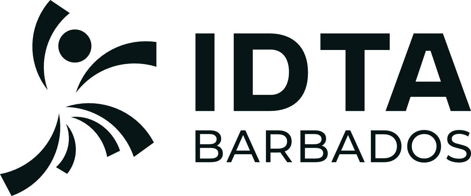
Now this concept features a stylised figure resembling a dancer created from flowing shapes that suggest energy, rhythm, and grace. Positioned next to the “IDTA BARBADOS” wordmark, it adds a human touch, emphasising inclusivity and emotional resonance.
Now this concept features a stylised figure resembling a dancer created from flowing shapes that suggest energy, rhythm, and grace. Positioned next to the “IDTA BARBADOS” wordmark, it adds a human touch, emphasising inclusivity and emotional resonance.
Final selection: Logo concept 3
Final selection: Logo concept 3
As you can see, Concept 3 was chosen by the client.
As you can see, Concept 3 was chosen by the client.
Why does concept 3 work?
Why does concept 3 work?
The chosen logo achieved broader appeal across dance styles by using an abstract figure that isn’t tied to any single genre, instead suggesting movement in its most universal form. Paired with a sleek wordmark, the lively symbol created a modern visual identity that felt fresh and contemporary. Its dynamic, approachable design resonated strongly with younger dancers, supporting the goal of increased youth engagement. At the same time, the dancer motif provided a clear, memorable visual cue, ensuring more explicit recognition across both digital platforms and live events.
The chosen logo achieved broader appeal across dance styles by using an abstract figure that isn’t tied to any single genre, instead suggesting movement in its most universal form. Paired with a sleek wordmark, the lively symbol created a modern visual identity that felt fresh and contemporary. Its dynamic, approachable design resonated strongly with younger dancers, supporting the goal of increased youth engagement. At the same time, the dancer motif provided a clear, memorable visual cue, ensuring more explicit recognition across both digital platforms and live events.
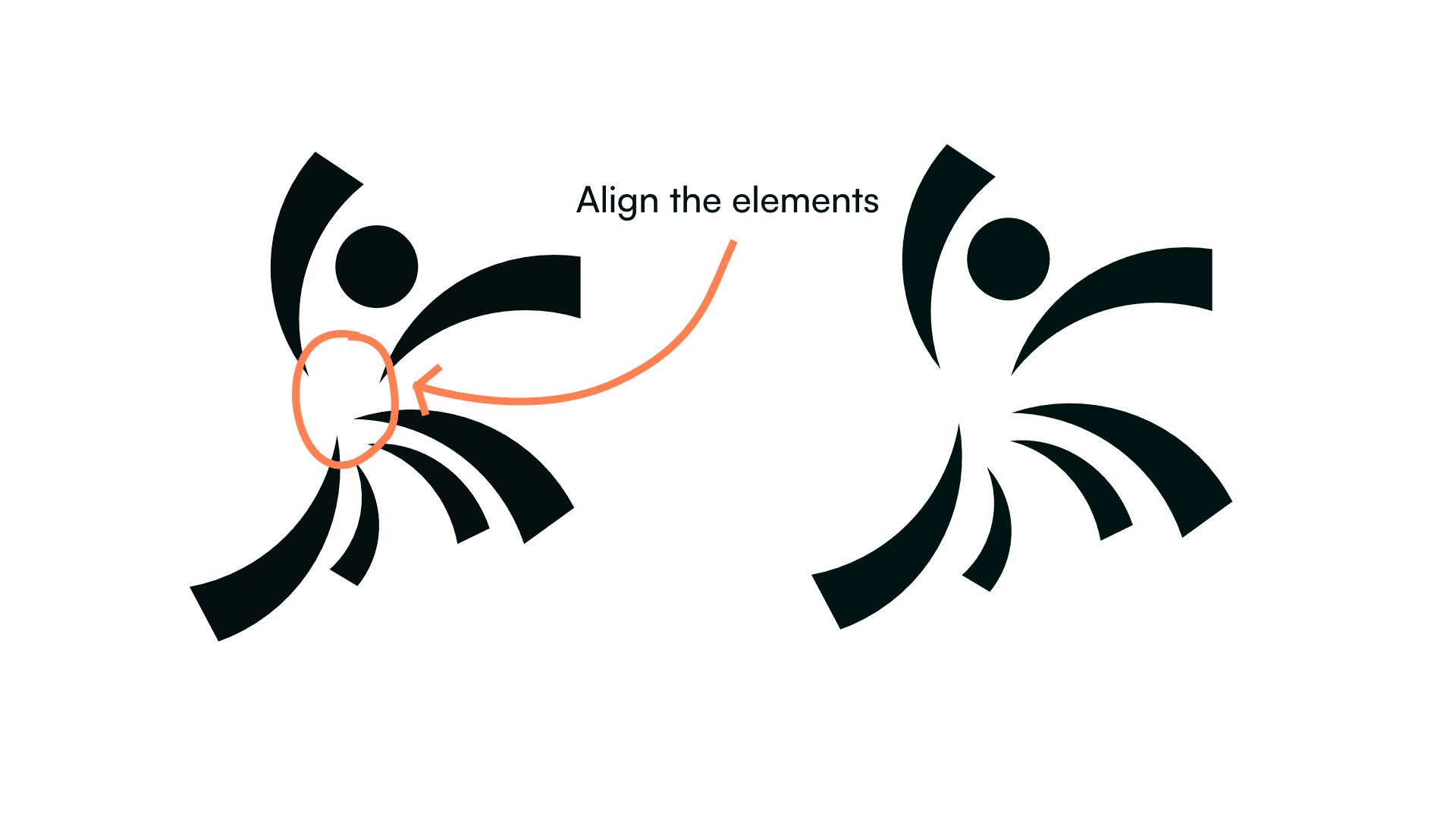
Refinments
Here are some points to be corrected with the logo
Here are some points to be corrected with the logo
Colour palette
Let's take a look at the colours for the brand
Emerald
Hex #52E081
Black
Hex #02020B
Golden Pollen
Hex #F9CB40
Snow
Hex #FFFAFB
Cinnabar
Hex #FF3C38
Emerald
Hex #52E081
Golden Pollen
Hex #F9CB40
Cinnabar
Hex #FF3C38
Black
Hex #02020B
Snow
Hex #FFFAFB
Emerald
Hex #52E081
Golden Pollen
Hex #F9CB40
Cinnabar
Hex #FF3C38
Black
Hex #02020B
Snow
Hex #FFFAFB
Why these colours?
Emerald (#52E081) anchors IDTA Barbados’ visual identity with a sense of growth and vitality in dance and dance education. As the primary colour, it sets a fresh, modern tone that’s both welcoming and energising. Supporting it, Golden Pollen (#F9CB40) adds warmth and celebratory flair, while Cinnabar (#FF3C38) injects passion and intensity. Black (#02020B) provides contrast and professionalism, grounding the palette. Finally, off-white (#FFFAFB) ensures clarity and accessibility, making the palette inclusive and legible across all media.
Typography
Primary Typeface: Gunterz
The IDTA Barbados wordmark uses Gunterz, a sans‑serif font with clean, modern letterforms. It combines bold, contemporary geometry with subtle traditional influences, striking a balance between modernity and heritage. This typeface was chosen for its ability to appeal to both young and established audiences, ensuring the brand feels fresh yet professional.
The IDTA Barbados wordmark uses Gunterz, a sans‑serif font with clean, modern letterforms. It combines bold, contemporary geometry with subtle traditional influences, striking a balance between modernity and heritage. This typeface was chosen for its ability to appeal to both young and established audiences, ensuring the brand feels fresh yet professional.
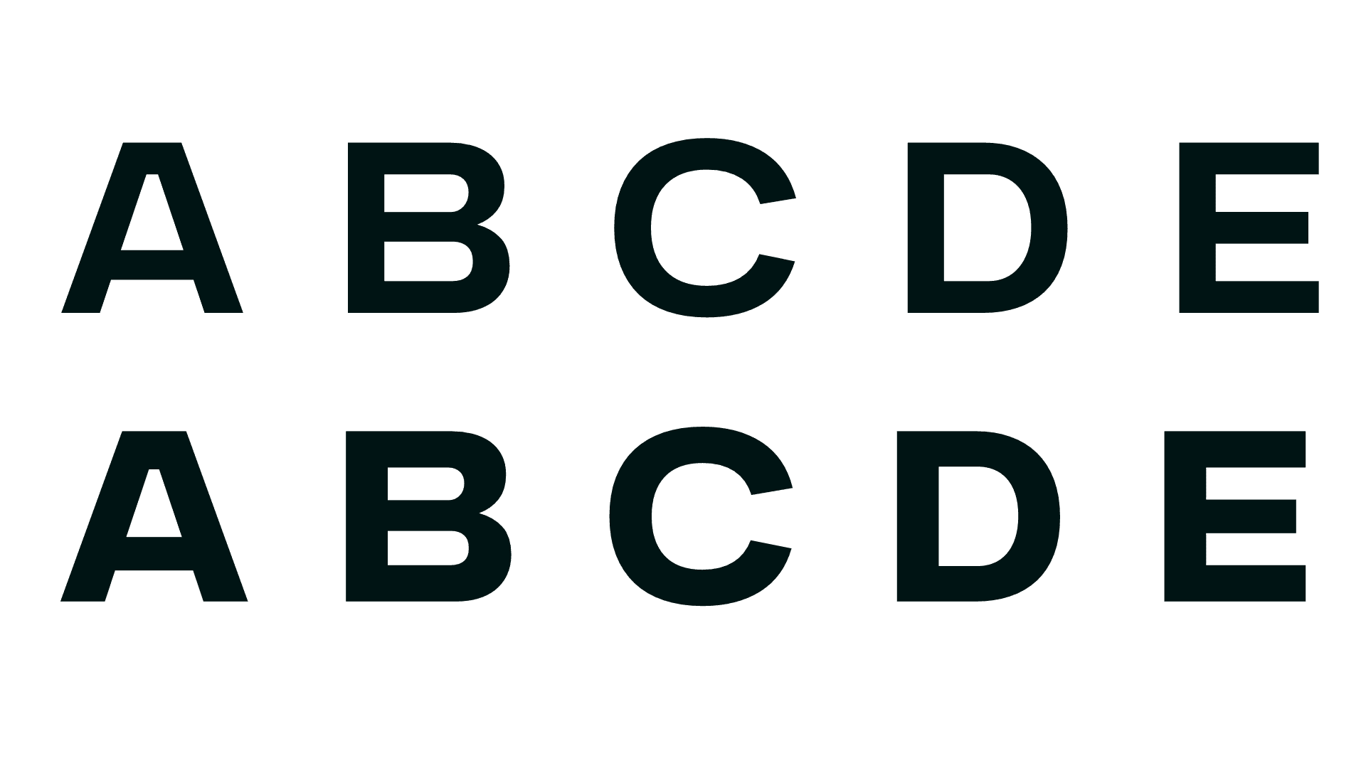
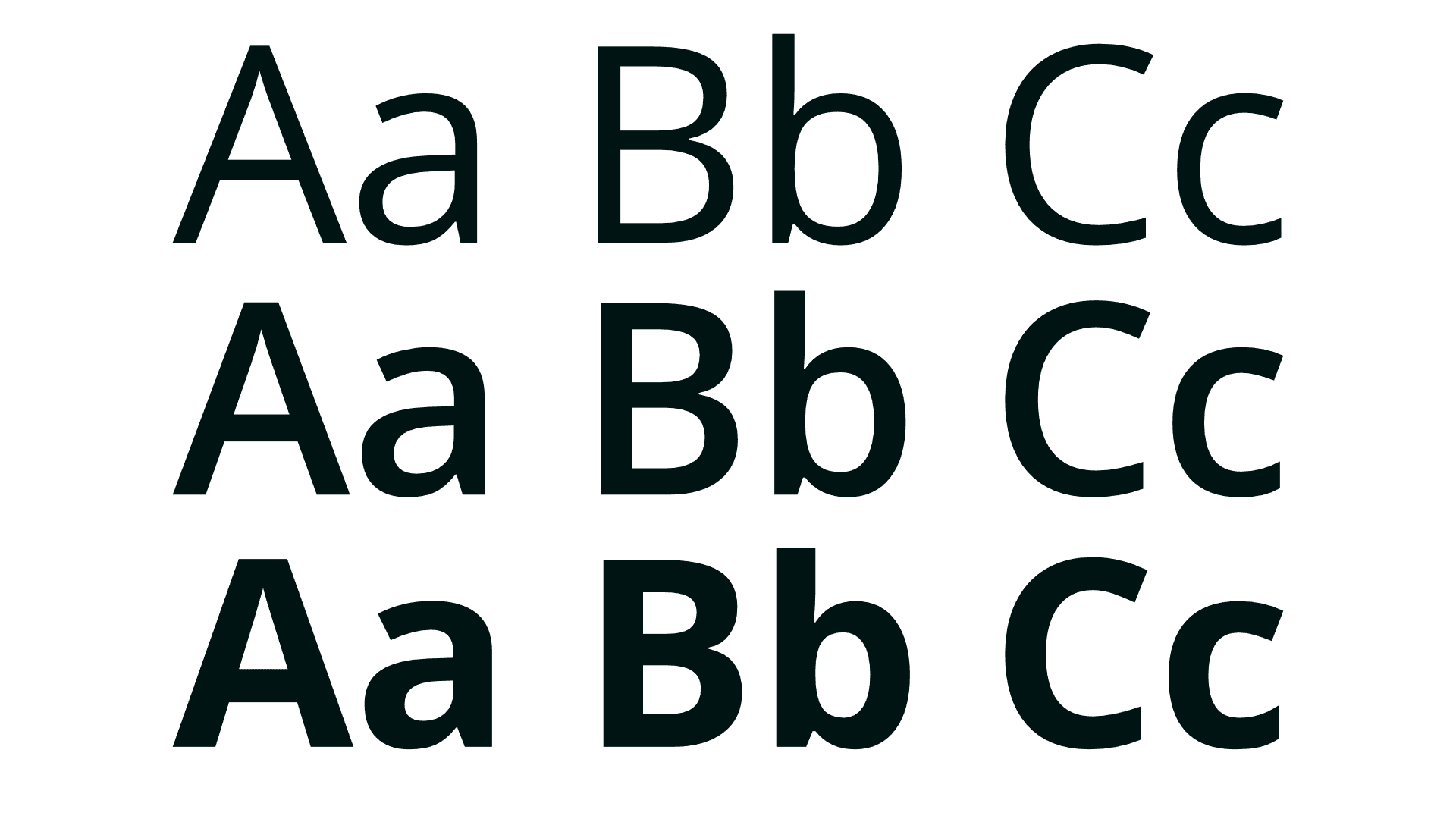
Media Typefaces
Chosen for supporting materials such as social media, flyers, digital and printed communications.
Chosen for supporting materials such as social media, flyers, digital and printed communications.
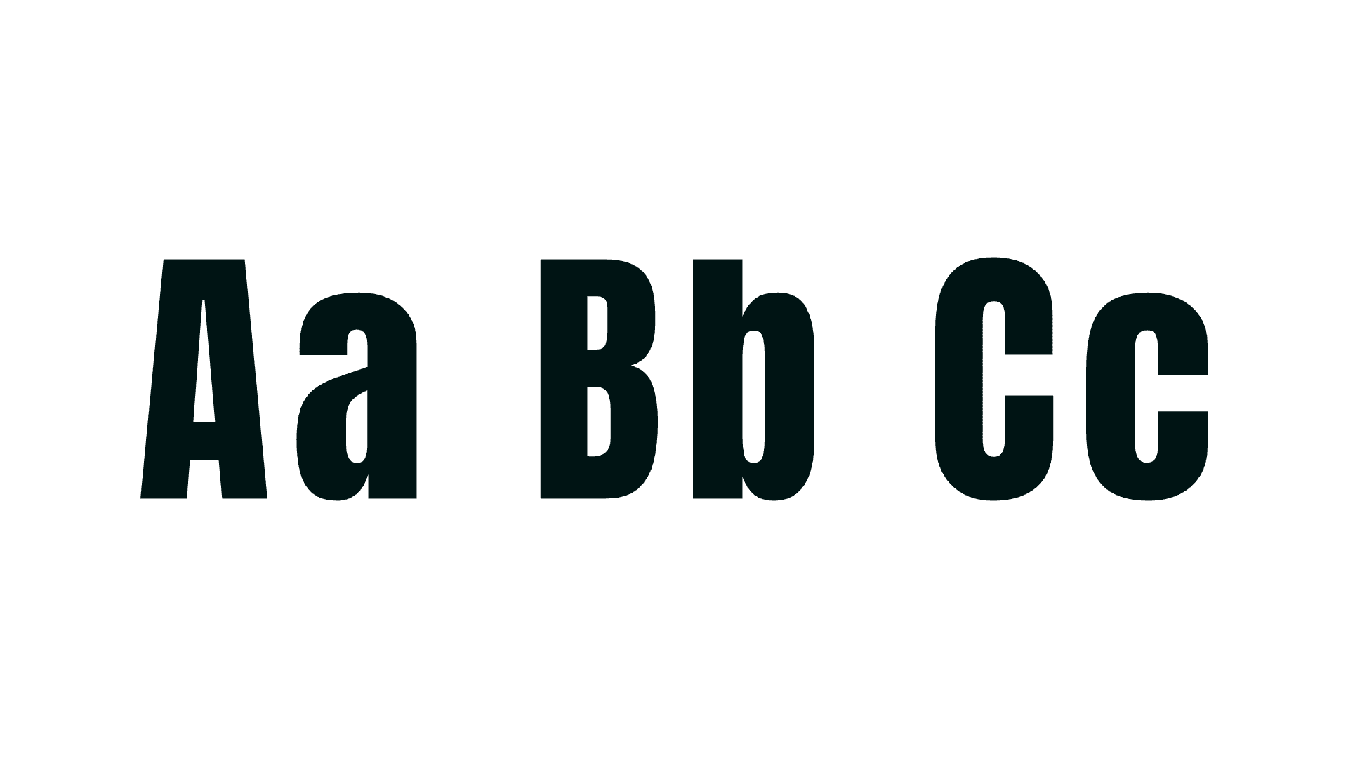
For supporting media such as social posts, flyers, and digital communications, IDTA Barbados uses Anton (top) and Open Sans (bottom). Anton, a bold and condensed sans‑serif, delivers strong headlines and impactful emphasis, while Open Sans, a versatile humanist sans‑serif, ensures clarity and accessibility for longer text and captions. Together, they balance energy with readability, creating a system that works seamlessly across print and digital platforms while complementing the Gunterz wordmark.
For supporting media such as social posts, flyers, and digital communications, IDTA Barbados uses Anton (top) and Open Sans (bottom). Anton, a bold and condensed sans‑serif, delivers strong headlines and impactful emphasis, while Open Sans, a versatile humanist sans‑serif, ensures clarity and accessibility for longer text and captions. Together, they balance energy with readability, creating a system that works seamlessly across print and digital platforms while complementing the Gunterz wordmark.
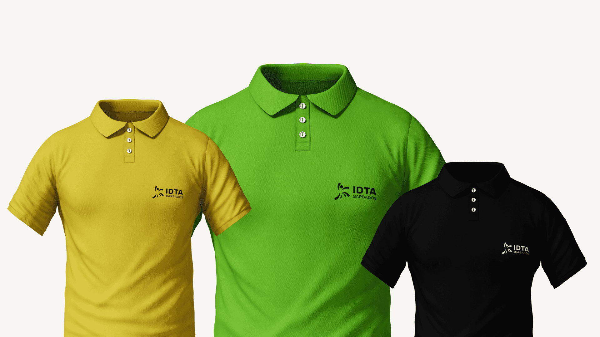
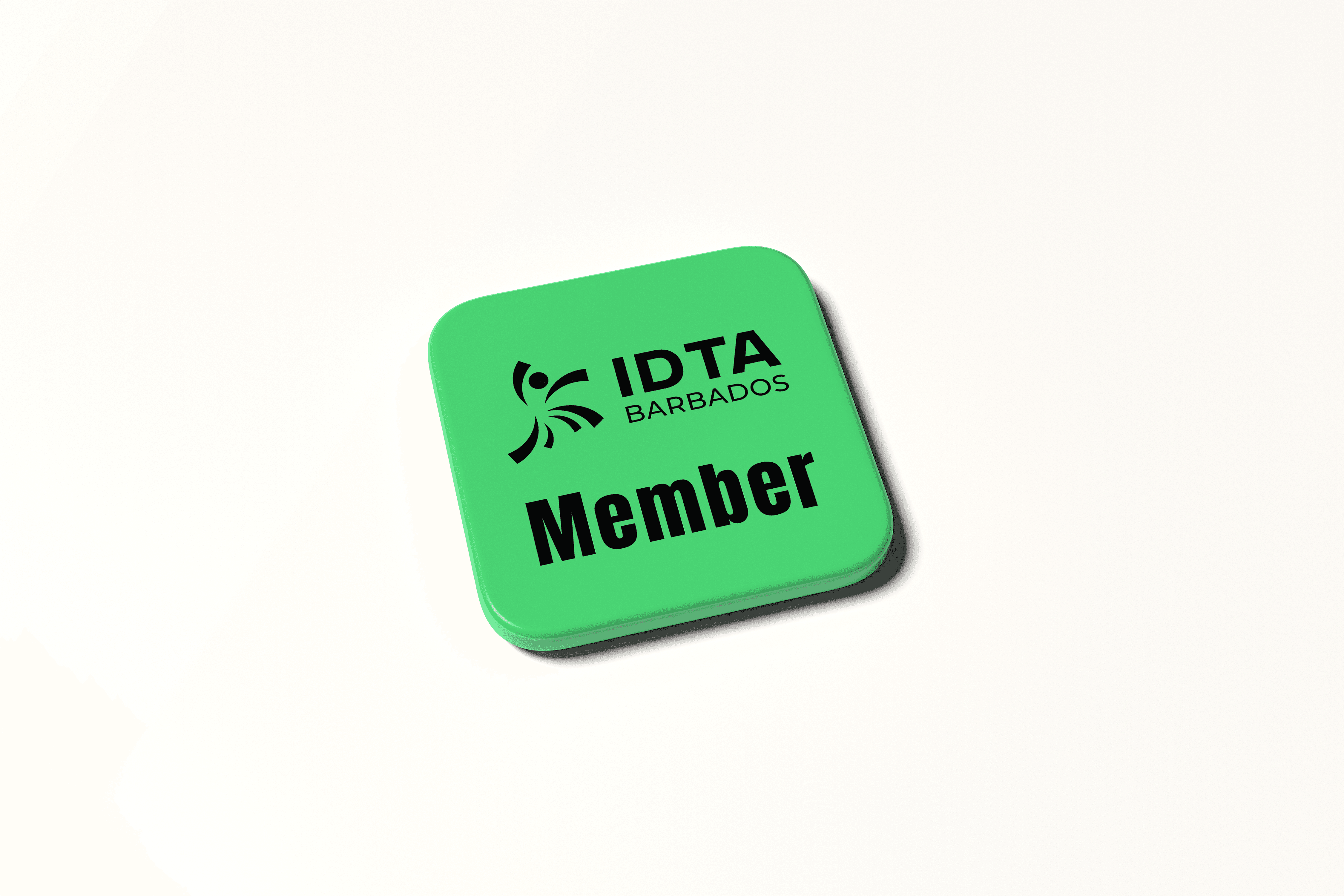
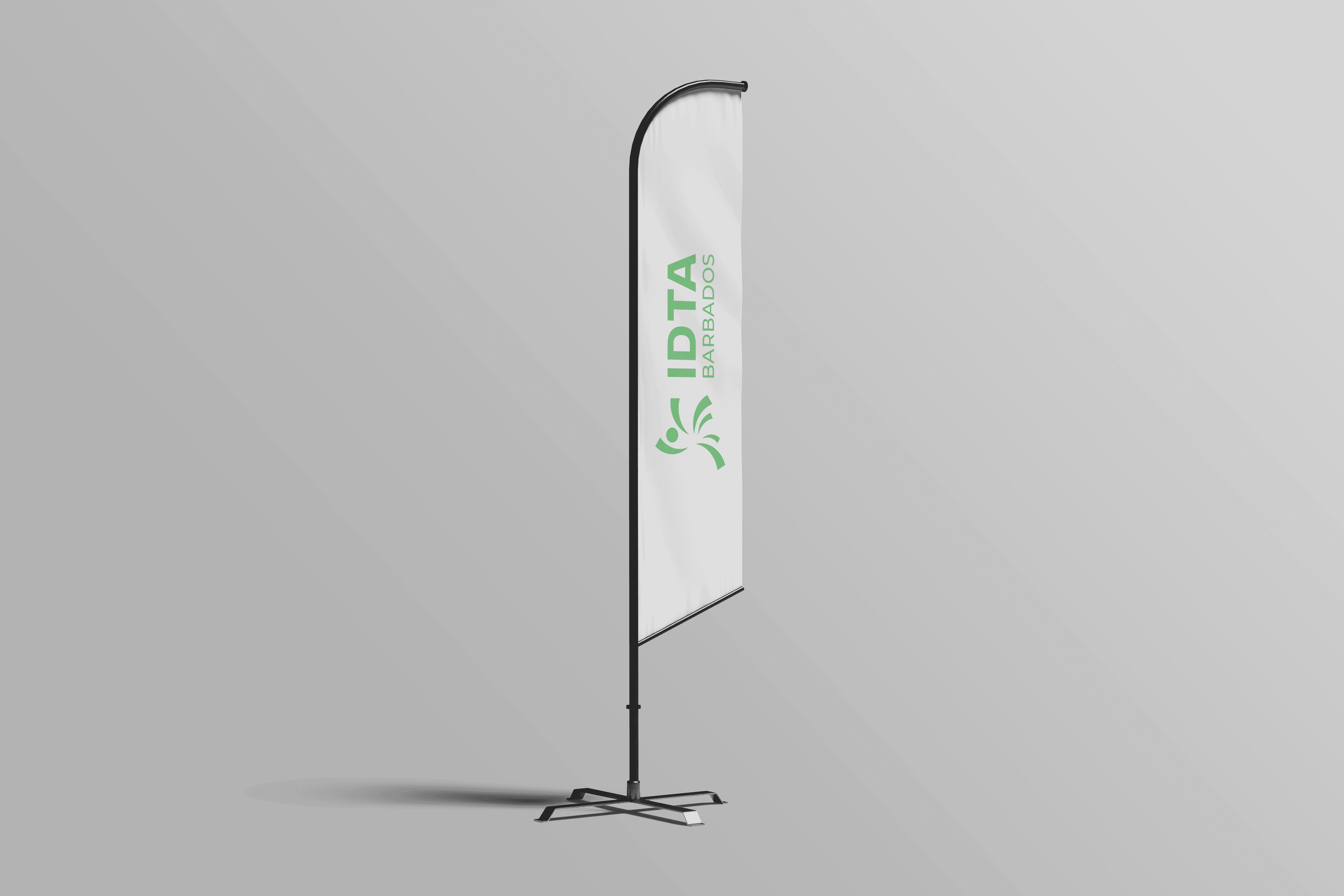
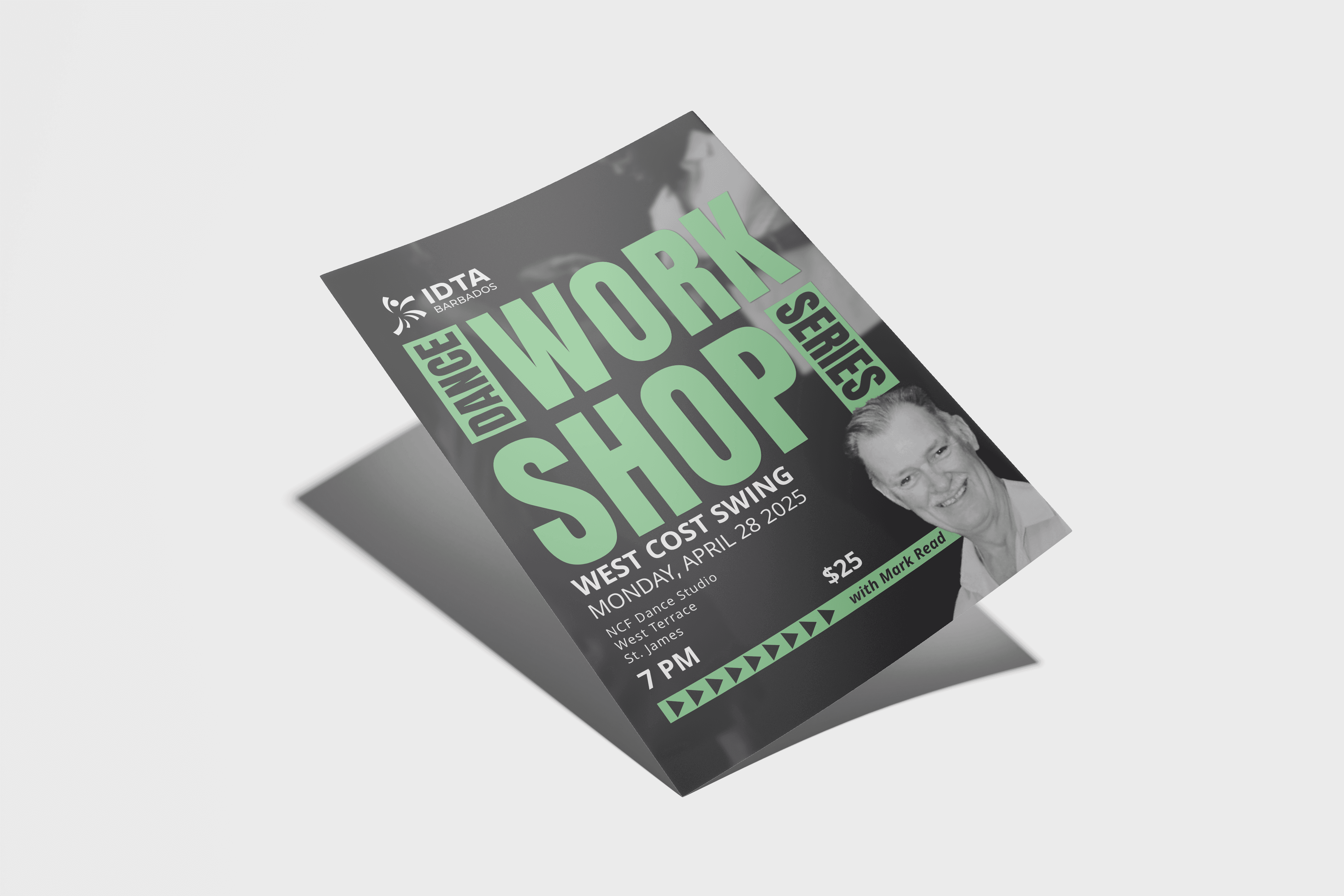
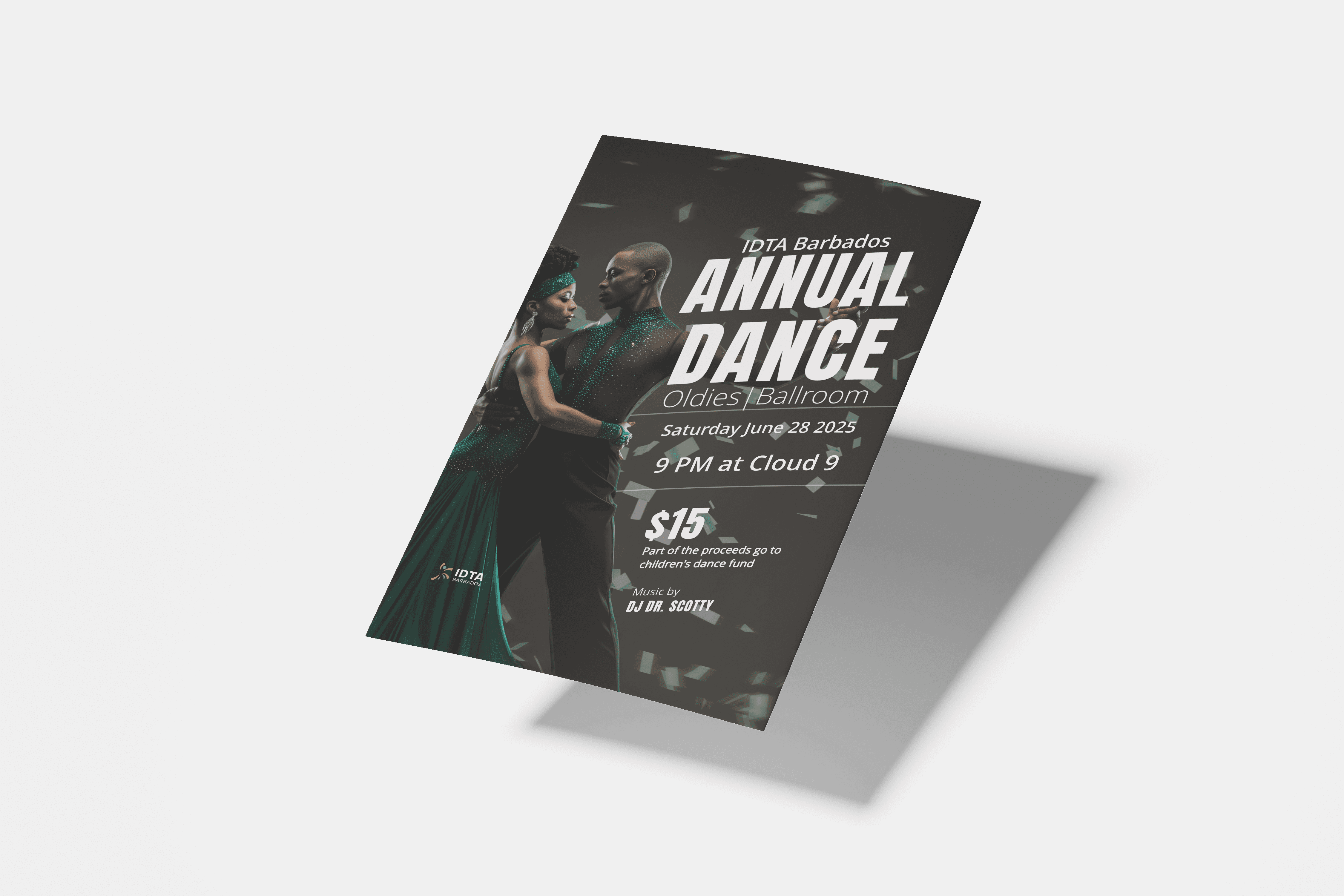
Logo usages
Here is a look at how the logo is to be used
Conculsion
Conculsion
This rebranding project for IDTA Barbados was finished before the SPIRAL framework was officially established, but it significantly influenced its development. It highlighted the importance of combining symbolism with clarity and emphasised the need for systematic iteration, community involvement, and emotional appeal in visual identity efforts. The process also enhanced our understanding of how design can foster youth engagement and promote genre inclusivity, insights that now inform our approach in all Flowform Creative projects.
This rebranding project for IDTA Barbados was finished before the SPIRAL framework was officially established, but it significantly influenced its development. It highlighted the importance of combining symbolism with clarity and emphasised the need for systematic iteration, community involvement, and emotional appeal in visual identity efforts. The process also enhanced our understanding of how design can foster youth engagement and promote genre inclusivity, insights that now inform our approach in all Flowform Creative projects.
Thank you for your time!