Re-Tooling of Barbados Dance Council
Re-Tooling of Barbados Dance Council
2025
Helping BDC to step forward
Who is the Barbados Dance Council?
Who is the Barbados Dance Council?
The Barbados Dance Council (BDC), founded in 2001 by Livingstone Alleyne, aimed to join the World Dance Council (WDC). He gathered qualified dance teachers to create a national body to improve Ballroom and Latin dance standards and gain international recognition. This led to Barbados joining the WDC in 2003, which governs international Ballroom and Latin competitions.
The Barbados Dance Council (BDC), founded in 2001 by Livingstone Alleyne, aimed to join the World Dance Council (WDC). He gathered qualified dance teachers to create a national body to improve Ballroom and Latin dance standards and gain international recognition. This led to Barbados joining the WDC in 2003, which governs international Ballroom and Latin competitions.
Why the rebrand?
Why the rebrand?
Barbados Dance Council seeks to update its public presentation to attract more members and competitors.
Barbados Dance Council seeks to update its public presentation to attract more members and competitors.
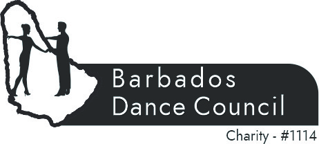

Previous logo

Design objectives
•
Make the brand more appealing to additional dancers
•
To have a modern visual identity
•
Increased youth engagement
•
Clearer brand recognition
Approach
This project was completed before the SPIRAL framework, but it helped shape its foundations.
This project was completed before the SPIRAL framework, but it helped shape its foundations.
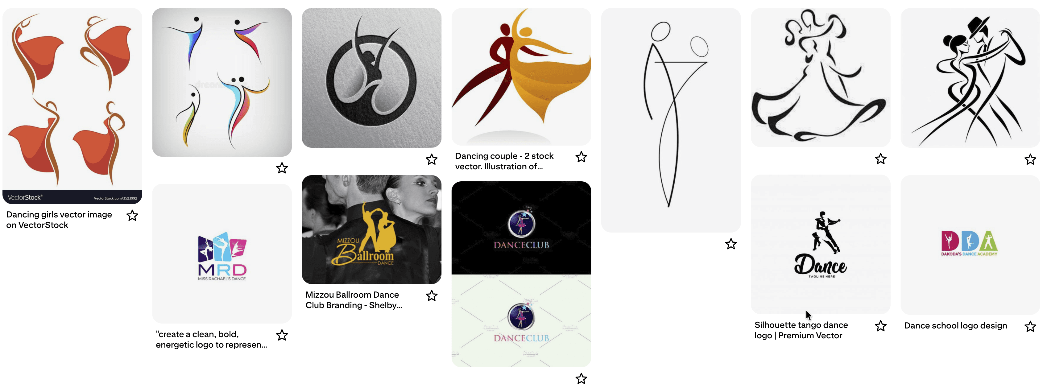
Searches were done for inspiration
Pinterest mood-board
Pinterest mood-board
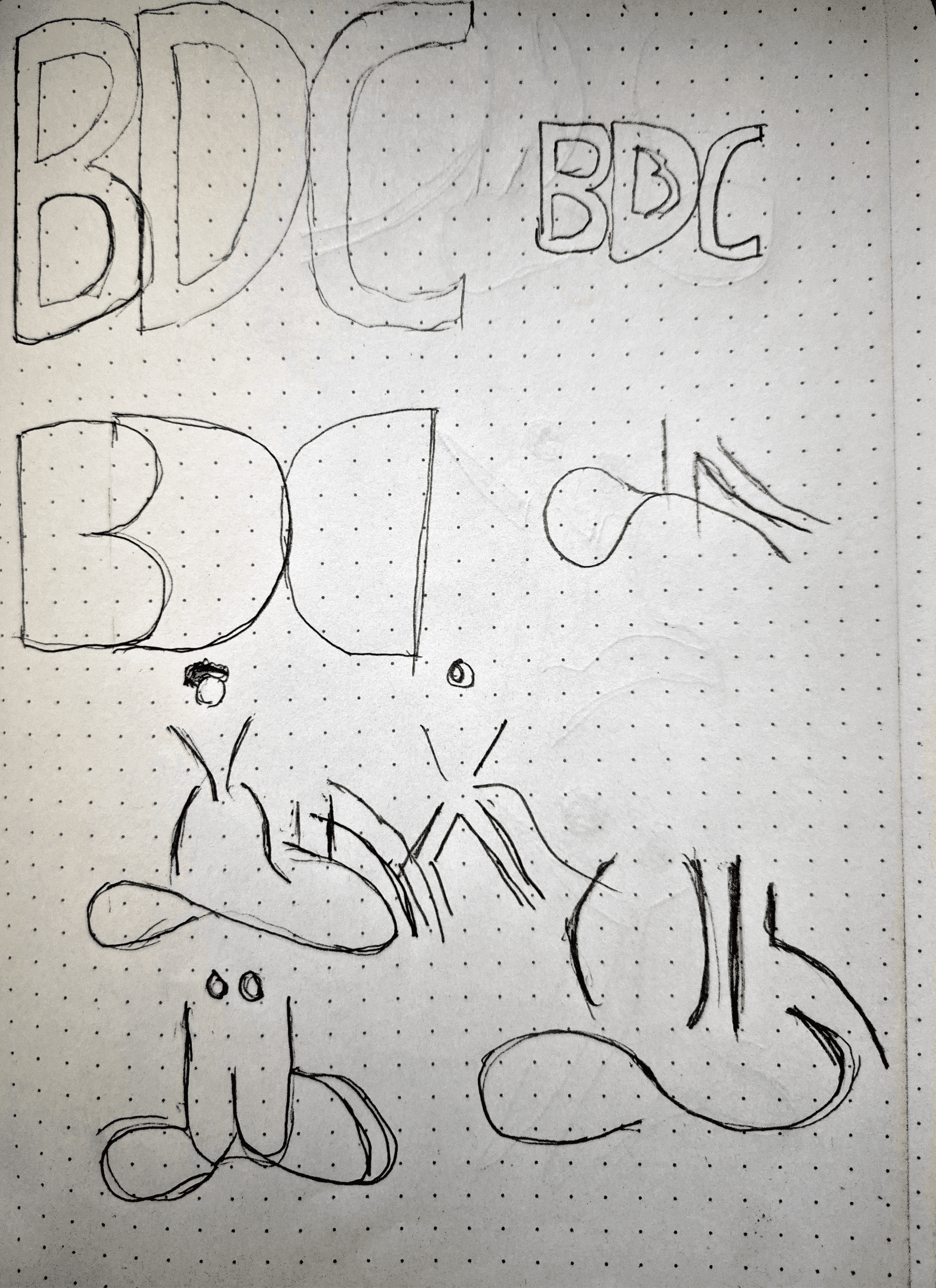
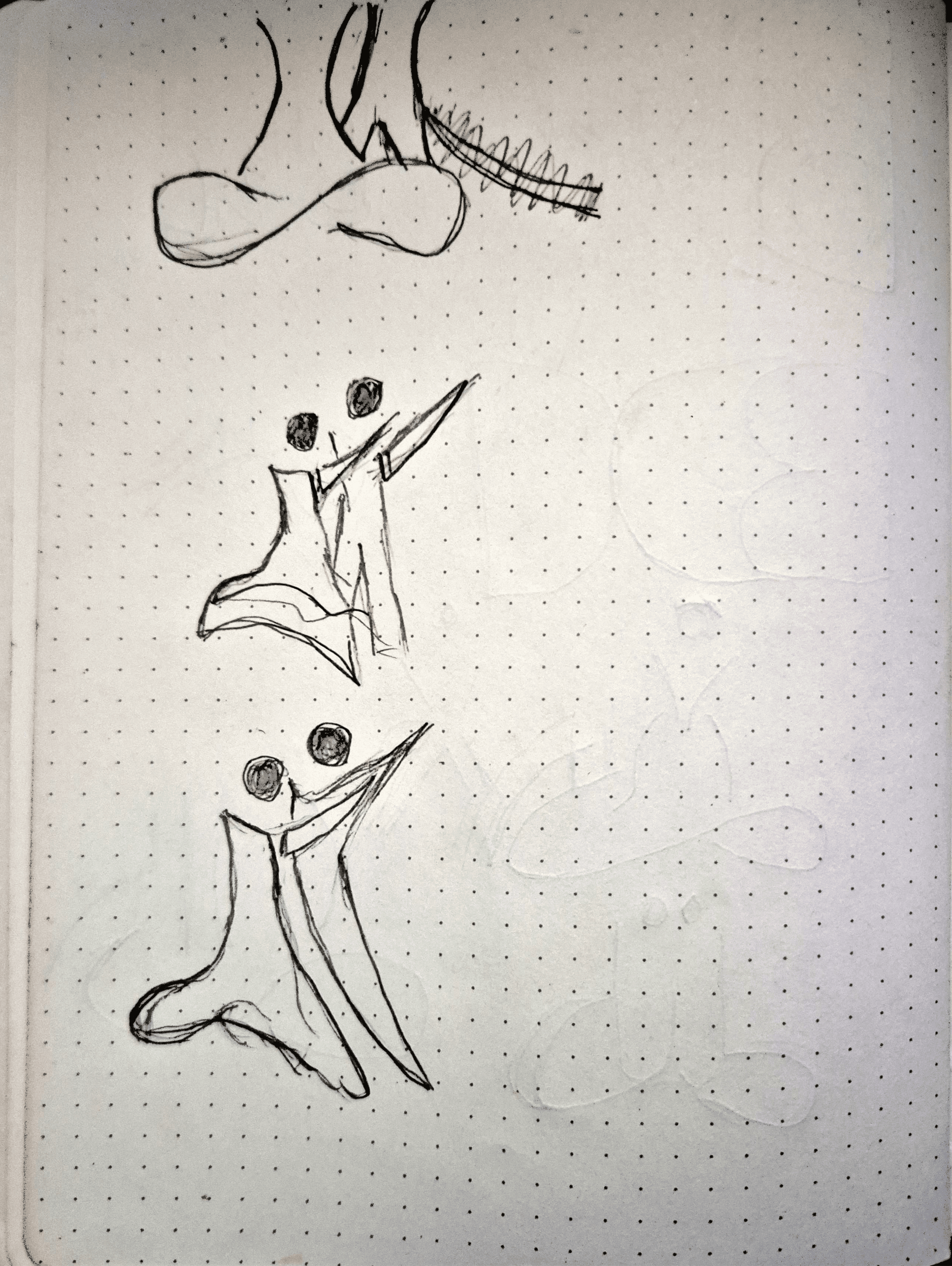
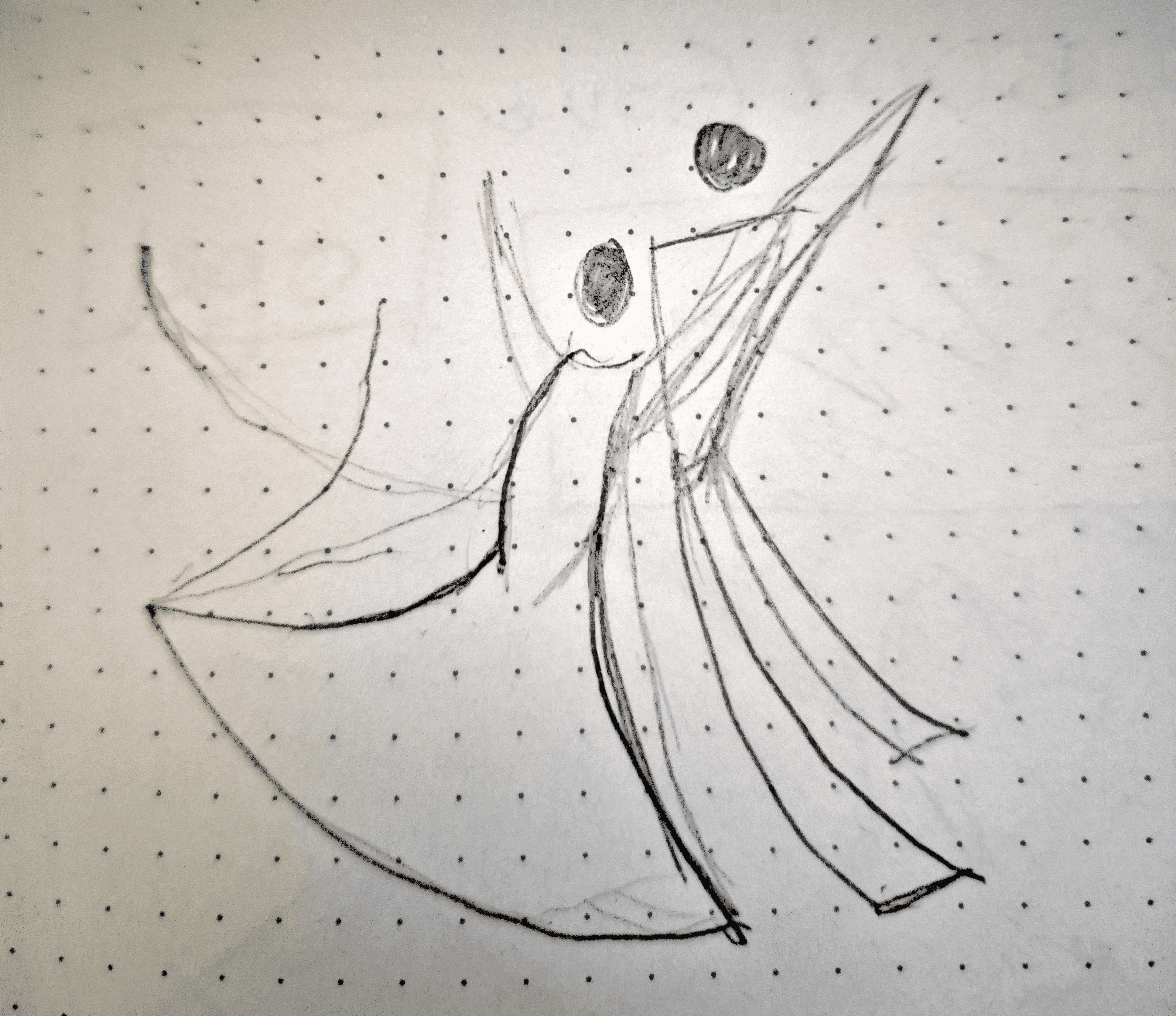
Sketches
Sketches are done to get out some different ideas of the symbol that would encapsulate the goals
Sketches are done to get out some different ideas of the symbol that would encapsulate the goals
Idea to life
Three ideas came about from the research
1
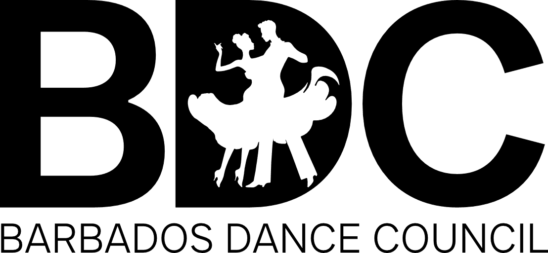
This concept displays' BDC” in bold black letters, with a dancing couple silhouette in the' D. ' Below, ' BARBADOS DANCE COUNCIL” appears in uppercase, emphasising clarity. The embedded figure reflects the Council’s Ballroom and Latin roots, perfect for formal documents and legacy recognition.
This concept displays' BDC” in bold black letters, with a dancing couple silhouette in the' D. ' Below, ' BARBADOS DANCE COUNCIL” appears in uppercase, emphasising clarity. The embedded figure reflects the Council’s Ballroom and Latin roots, perfect for formal documents and legacy recognition.
2

This design shows a stylised line drawing of two dancers above an infinity symbol, symbolising continuity and inclusivity. The text “Barbados Dance Council” appears to the right, with “Barbados” in bold for emphasis. Its minimalist style and genre-neutral symbolism suit expanding the Council’s reach beyond Ballroom and Latin.
This design shows a stylised line drawing of two dancers above an infinity symbol, symbolising continuity and inclusivity. The text “Barbados Dance Council” appears to the right, with “Barbados” in bold for emphasis. Its minimalist style and genre-neutral symbolism suit expanding the Council’s reach beyond Ballroom and Latin.
3
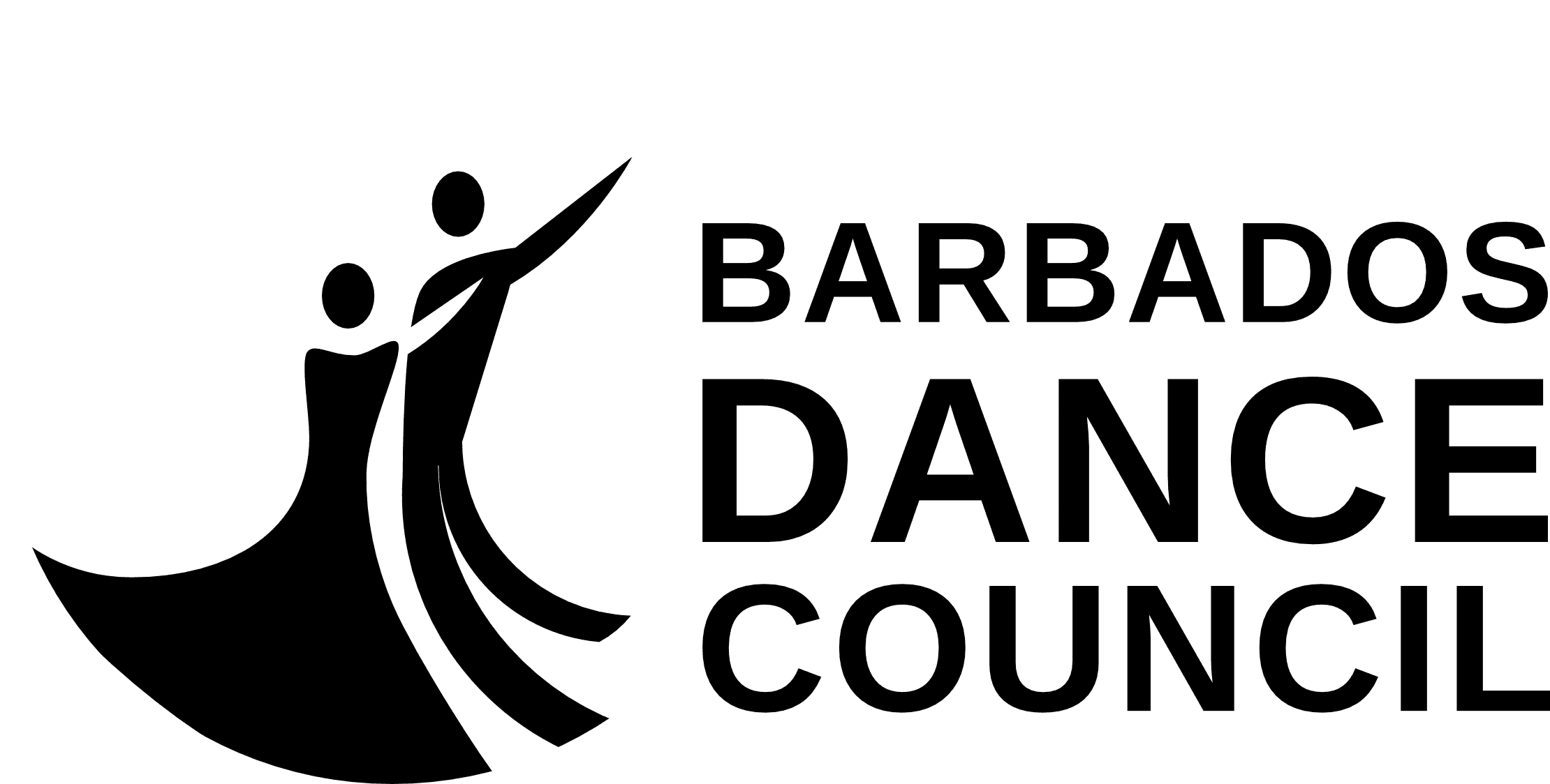
This concept features a flowing silhouette of a dancing couple highlighting motion, elegance, and emotion. The bold “DANCE” draws focus to the Council’s main goal, with uppercase letters maintaining professionalism. The expressive figure and strong typography make the logo versatile and engaging.
This concept features a flowing silhouette of a dancing couple highlighting motion, elegance, and emotion. The bold “DANCE” draws focus to the Council’s main goal, with uppercase letters maintaining professionalism. The expressive figure and strong typography make the logo versatile and engaging.
Final selection: Logo concept 3
Final selection: Logo concept 3
As you can see, Concept 3 was chosen by the client.
As you can see, Concept 3 was chosen by the client.
Why does concept 3 work?
Why does concept 3 work?
Logo Concept 3 was selected because it is the most expressive and dynamic of the three options. Its flowing silhouette of dancers conveys motion and elegance, while the bold highlighting of “DANCE” in the wordmark clearly emphasises the Council’s focus. The design strikes a balance between professionalism and emotional appeal, making it adaptable for formal documents, event branding, merchandise, and public outreach. By integrating strong typography with an eye-catching symbol, Concept 3 portrays the Barbados Dance Council as modern, approachable, and culturally rich, while honouring its Ballroom and Latin heritage.
Logo Concept 3 was selected because it is the most expressive and dynamic of the three options. Its flowing silhouette of dancers conveys motion and elegance, while the bold highlighting of “DANCE” in the wordmark clearly emphasises the Council’s focus. The design strikes a balance between professionalism and emotional appeal, making it adaptable for formal documents, event branding, merchandise, and public outreach. By integrating strong typography with an eye-catching symbol, Concept 3 portrays the Barbados Dance Council as modern, approachable, and culturally rich, while honouring its Ballroom and Latin heritage.

Colour palette
Let's take a look at the colours for the brand
Sapphire Sky
Hex #1276DB
Harvest Gold
Hex #DB9012
Baltic Blue
Hex #385F86
Ink Black
Hex #050F19
Old Gold
Hex #DBB912
White
Hex #FFFEFD
Sapphire Sky
Hex #1276DB
Baltic Blue
Hex #385F86
Old Gold
Hex #DBB912
Harvest Gold
Hex #DB9012
Ink Black
Hex #050F19
White
Hex #FFFEFD
Sapphire Sky
Hex #1276DB
Baltic Blue
Hex #385F86
Old Gold
Hex #DBB912
Harvest Gold
Hex #DB9012
Ink Black
Hex #050F19
White
Hex #FFFEFD
Why these colours?
Sapphire Sky (#1276DB) exudes confidence and clarity, establishing a palette rooted in trust, energy, and movement, ideal for storytelling and digital communication. Baltic Blue (#385F86) introduces depth and calmness, enhancing layout structure and readability, while conveying discipline and focus in dance. Old Gold (#DBB912) adds a celebratory touch, symbolising achievement, tradition, and cultural pride. Harvest Gold (#DB9012) offers warmth and approachability, perfect for community engagement. Ink Black (#050F19) anchors the palette with professionalism and contrast, ensuring high legibility across formats. Finally, White (#FFFFFD) adds clarity and openness, making the palette welcoming and accessible for all audiences.
Typography
Primary Typeface: Techna Sans
The BDC uses Techna Sans for the wordmark. Techna Sans is a bold, semi‑geometric sans‑serif typeface with sharp stroke endings, low contrast, and a modern, authentic look, ideal for branding, headlines, and tight spacing. It is used to marry the logo to the traditional side of ballroom dance.
The BDC uses Techna Sans for the wordmark. Techna Sans is a bold, semi‑geometric sans‑serif typeface with sharp stroke endings, low contrast, and a modern, authentic look, ideal for branding, headlines, and tight spacing. It is used to marry the logo to the traditional side of ballroom dance.
Media Typefaces
Chosen for supporting materials such as social media, flyers, digital and printed communications.
Chosen for supporting materials such as social media, flyers, digital and printed communications.
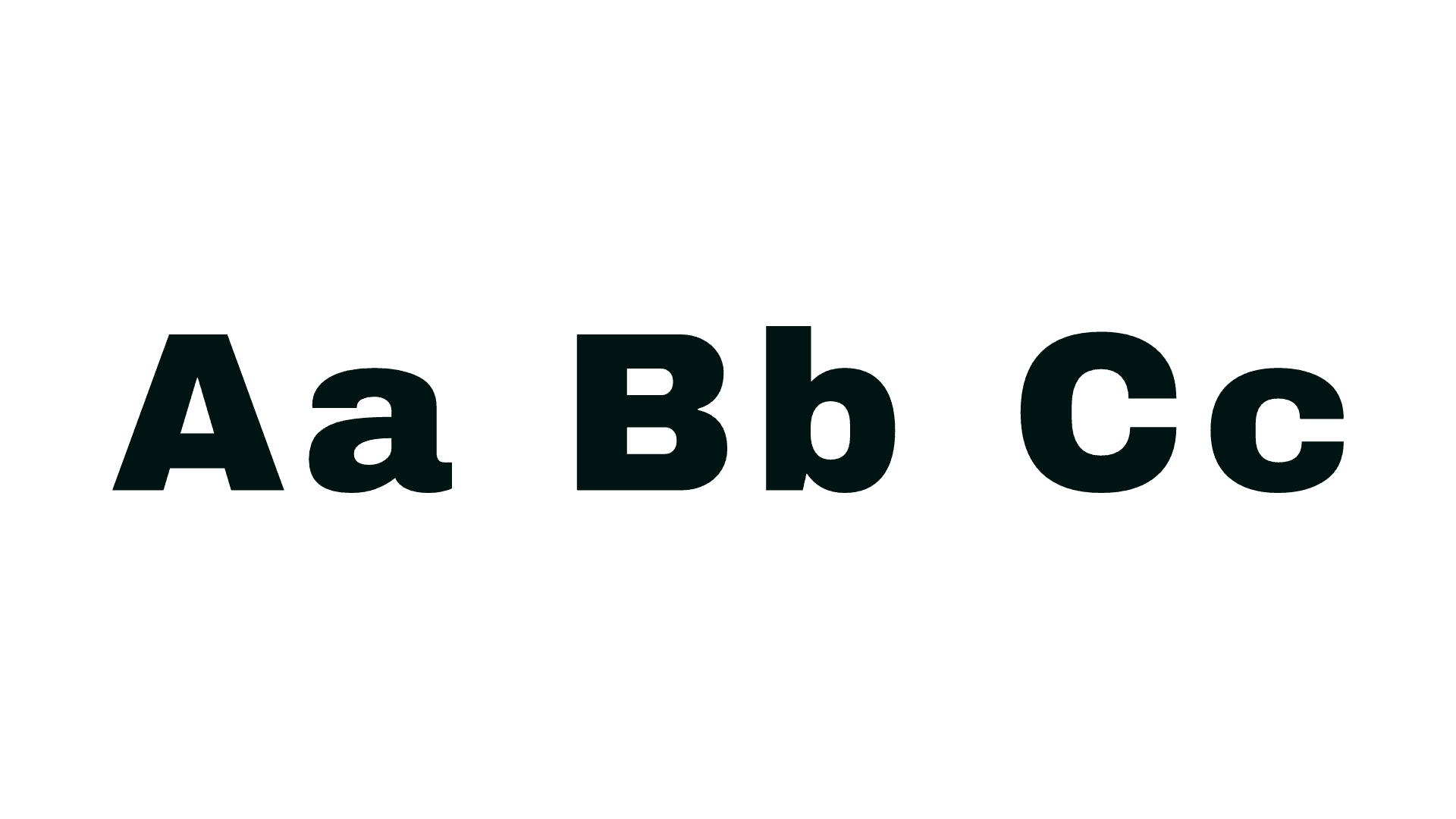
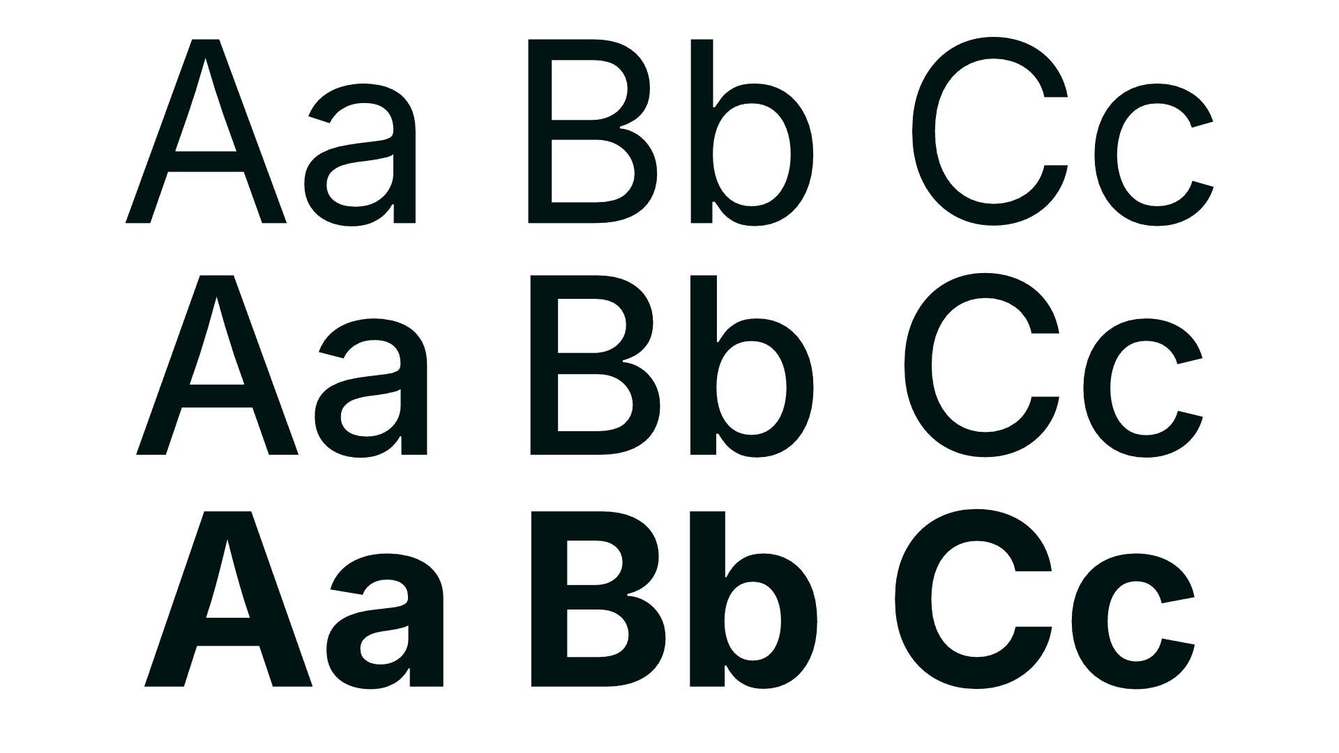
For supporting media such as social posts, flyers, and digital communications, Barbados Dance Council uses Archivo Black (top) and Inter (bottom). Archivo Black is a very bold, heavy font, similar to someone speaking loudly and confidently. It is designed to attract attention, making it ideal for large titles, posters, or headlines where words need to stand out. Inter, on the other hand, is a practical, everyday font that is clean, simple, and easy to read on screens. Its versatility is enhanced by a range of thicknesses from thin to bold, allowing it to be used effectively for both body text and headings without seeming out of place.
For supporting media such as social posts, flyers, and digital communications, Barbados Dance Council uses Archivo Black (top) and Inter (bottom). Archivo Black is a very bold, heavy font, similar to someone speaking loudly and confidently. It is designed to attract attention, making it ideal for large titles, posters, or headlines where words need to stand out. Inter, on the other hand, is a practical, everyday font that is clean, simple, and easy to read on screens. Its versatility is enhanced by a range of thicknesses from thin to bold, allowing it to be used effectively for both body text and headings without seeming out of place.

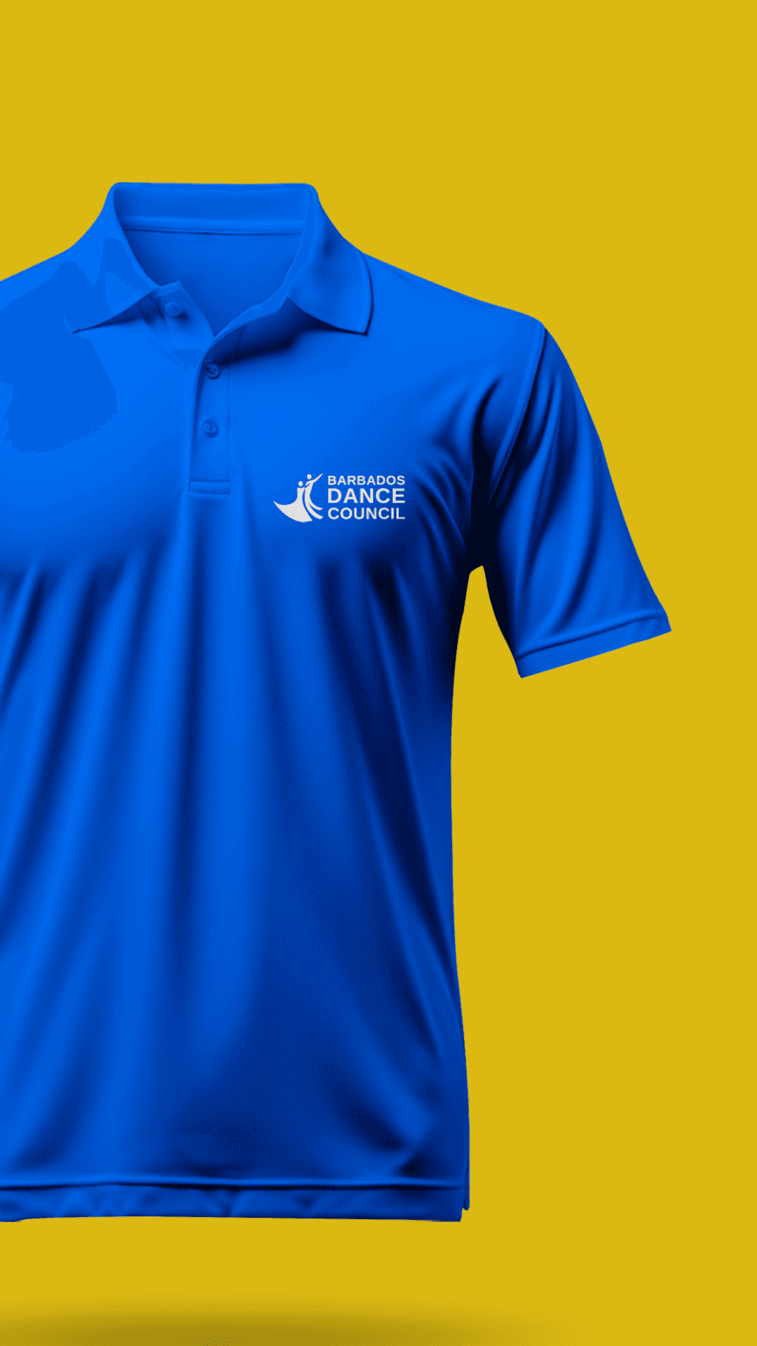
Logo usages
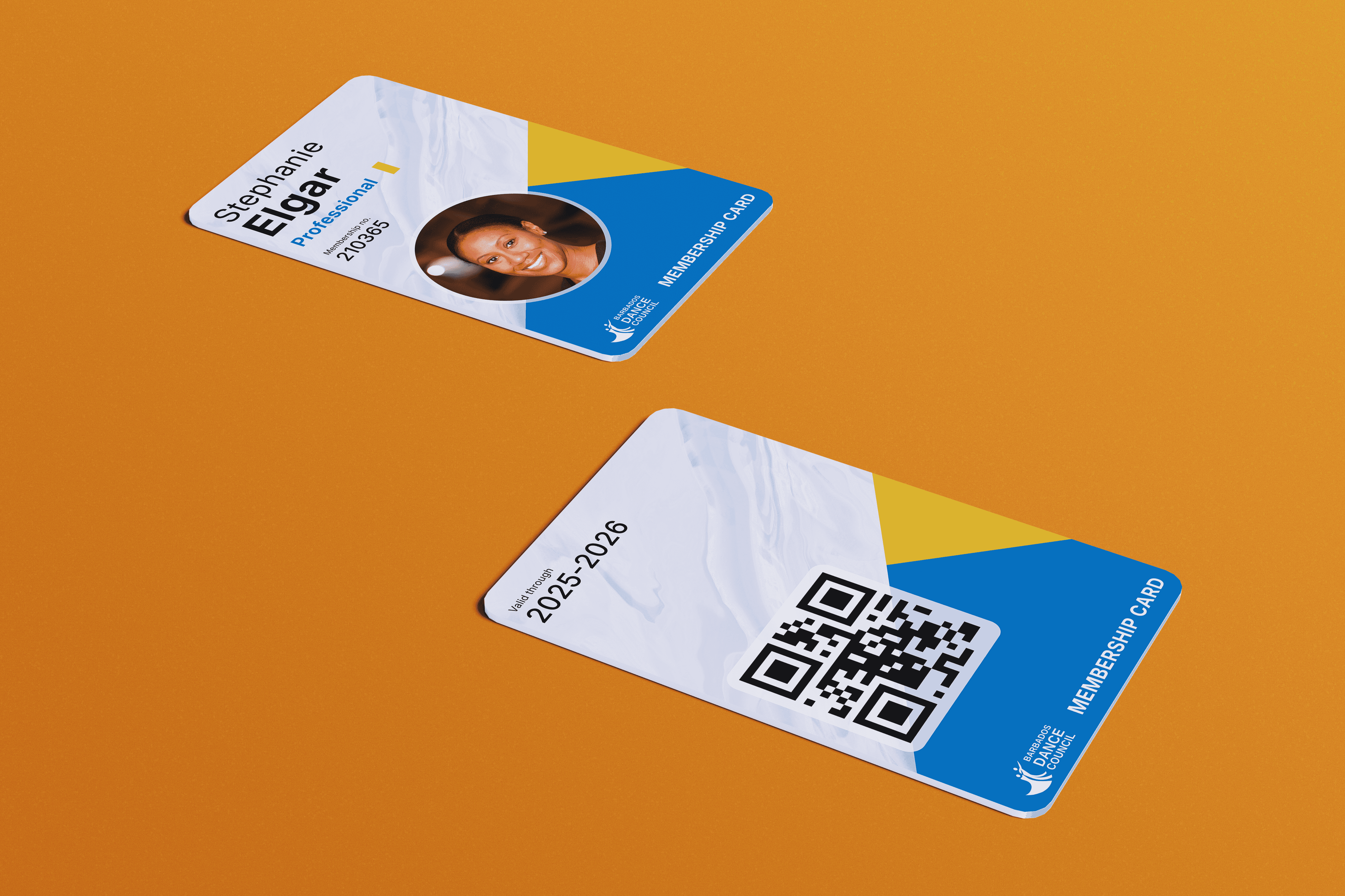
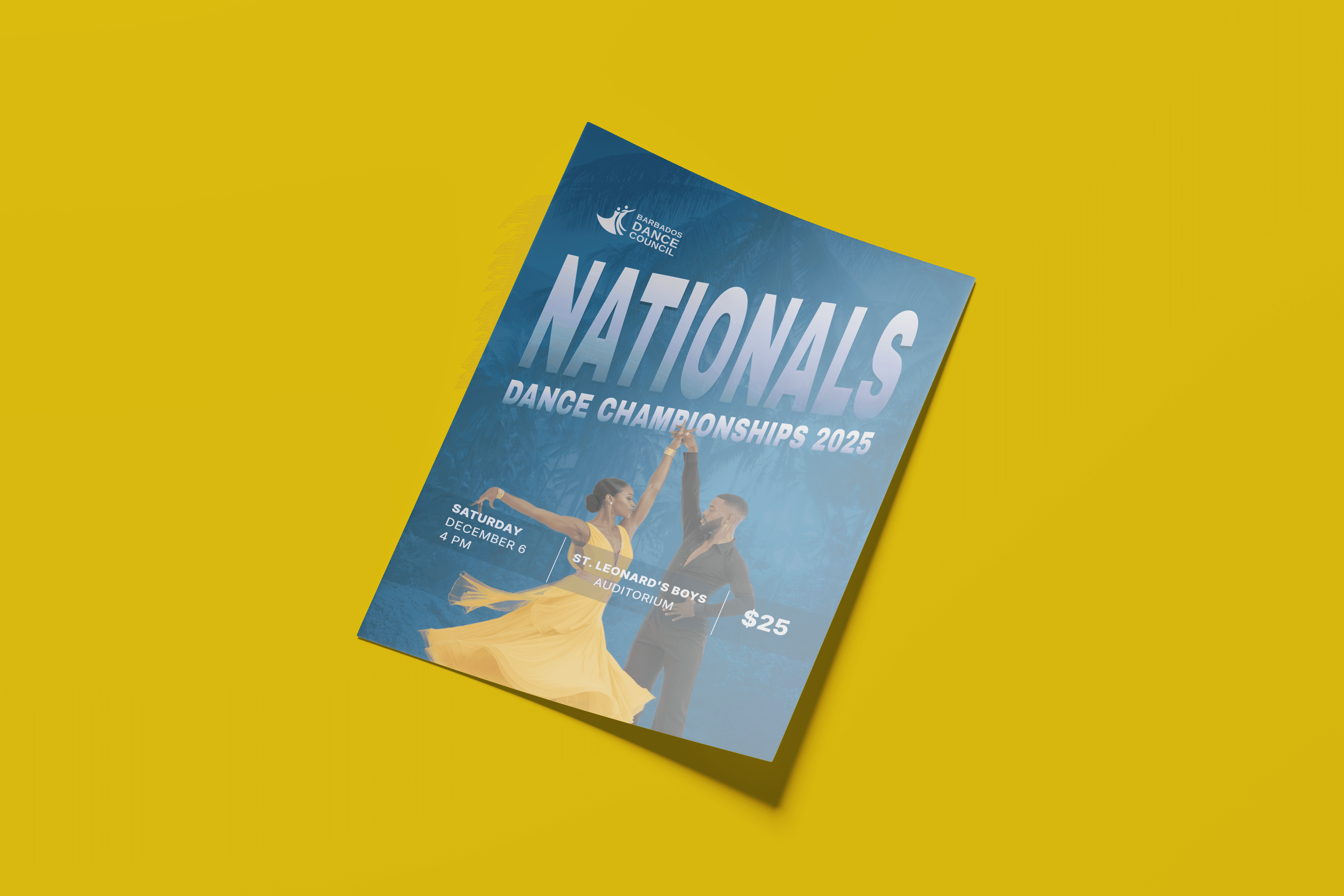
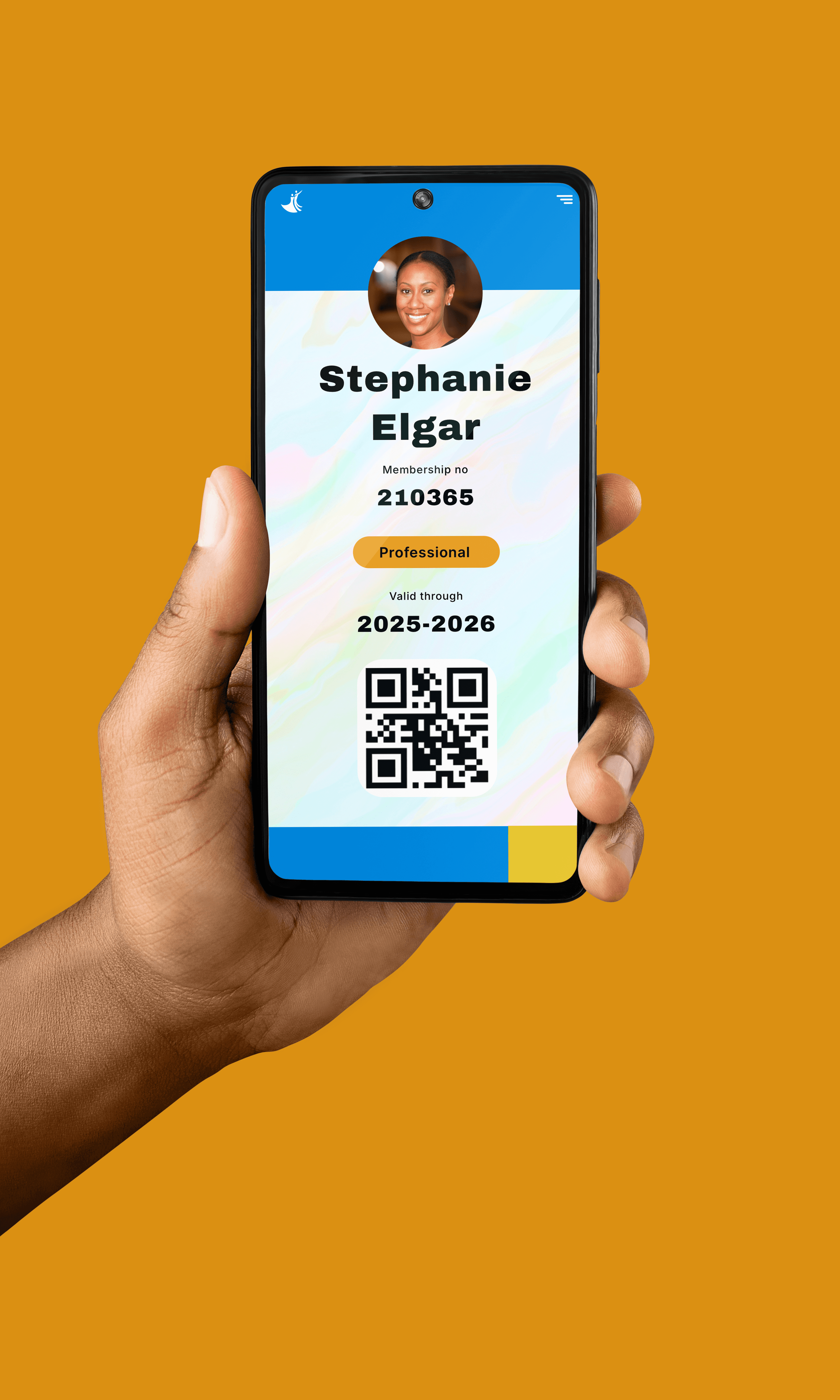
Here is a look at how the logo is to be used
Conculsion
The Barbados Dance Council’s rebranding was finished before the SPIRAL framework’s official launch, but it played a significant role in shaping it. The project underscored the importance of blending meaningful symbolism with clear communication. It demonstrated the value of iterative development, community involvement, and emotional connection in forming a visual identity. Additionally, it deepened our understanding of how intentional design can encourage youth participation and foster inclusivity across various dance styles, lessons that continue to guide our work at Flowform Creative.
The Barbados Dance Council’s rebranding was finished before the SPIRAL framework’s official launch, but it played a significant role in shaping it. The project underscored the importance of blending meaningful symbolism with clear communication. It demonstrated the value of iterative development, community involvement, and emotional connection in forming a visual identity. Additionally, it deepened our understanding of how intentional design can encourage youth participation and foster inclusivity across various dance styles, lessons that continue to guide our work at Flowform Creative.
